
The situation
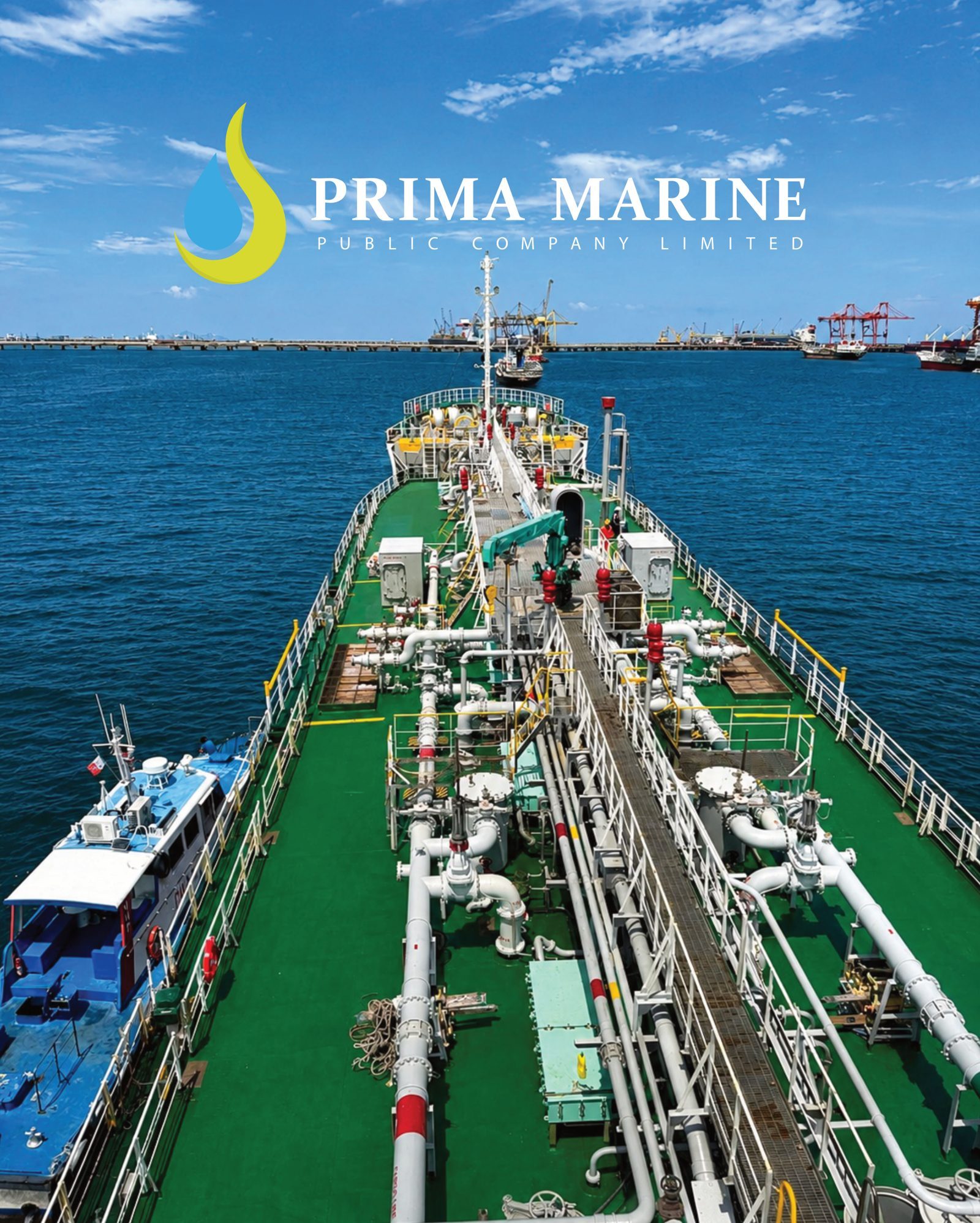
Prima Marine is a publicly listed marine logistics company that needed a website conveying scale, safety and reliability. At least three groups would visit it: customers, partners and investors.
The hard part was that each group looks for different information, so the site had to answer all of them without feeling cluttered. The project ran for 3 months, and we handled two things: UX/UI design and website development.
What we noticed
First, most readers are working people who open the site to find information that is to the point. They are not there for long stories, so we treated simple, well-ordered content as more important than anything flashy.
Second, a listed company earns credibility less through polished wording and more through complete, clearly organised information and a visual language that stays the same on every page.
What we decided, and why
We chose to build a professional corporate site that presents services and operations in an orderly way, makes enquiries easy for customers, and keeps a clearly separate section of company information for partners and investors. That way each group can walk to what it needs on its own.
We also decided early that Prima Marine's own team should be able to maintain the content. News and new services keep arriving, and if every change waits for a developer, a site slowly goes stale.
A good corporate website does not say everything; it gets each visitor to what they came for as fast as possible.
How the work ran
We began with discovery: the business, its audiences and its goals, so that scope and success criteria were set together with the team. Then we designed the structure, wireframes and visual interface so every page is clear and easy to use, from the services overview to the contact route.
In development we built a fast site that is responsive on every device, and tested it across devices and browsers before launch. At handover we showed the team how to update content.
- Discovery of business, audiences and success criteria
- Wireframes and visual interface design
- Fast, responsive development
- Cross-device and cross-browser testing, then handover with content training
What we delivered
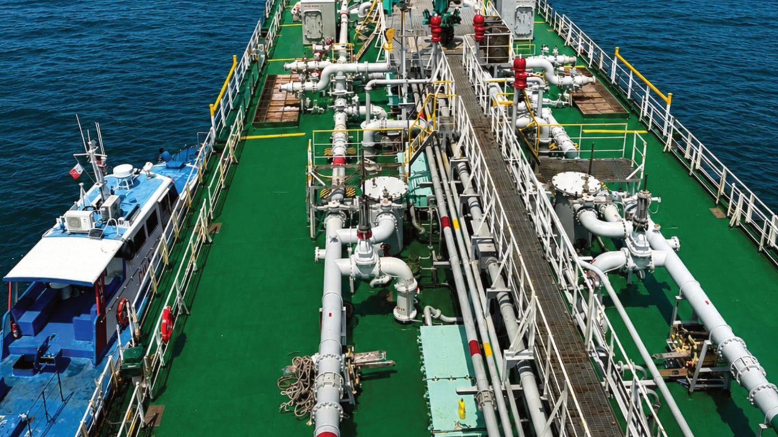
The result is a corporate website with a clear overview of the marine logistics services, the fleet and operations shown with strong imagery, and easy paths to enquire or contact the team. Company information is organised for partners and investors.
The layout and imagery are consistent across the site and suit a listed company. The team can update content independently and add new services or news without restructuring the site.
Lessons for logistics and marine businesses
This section is general advice, not project fact. If your business has several audiences, write down what each one wants to know first, and shape the menu and home page around those answers rather than around your internal org chart.
Also ask who will update the site six months after launch. If the answer is that someone has to wait for a developer, fix that during design, not afterwards.
- Write each audience's first question before designing navigation
- Prefer real photos of vessels and operations over generic stock images
- Keep investor and partner information easy to find but separate from service pages
- Let your own team edit news and services without writing code
Key takeaways
- A site with several audiences needs an information path per audience before any colour or font choice
- Credibility comes from order and consistency in both information and imagery
- Working readers want content to the point, not long copy
- Plan who maintains the content before the first line of code
- Test across devices and browsers before every launch
FAQ
Related services
Have a project like this in mind?
Tell us where you are today and we will suggest a sensible first step, with no obligation.
Talk to us