

SUDA: Brand Identity and Website for a Thai Restaurant in Bellevue, WA
Brand identity and a launch website for SUDA, a contemporary Thai restaurant and cocktail bar in Bellevue, Washington, built around the idea of Thai food, reimagined.
About the project
The project covered the brand identity, logo and a launch website for a restaurant that had not yet opened. The brief was to introduce SUDA's point of view in a few lines and one strong image, and to leave room to grow the site into a full menu and booking experience once the restaurant is open.
Services Provided
Challenge & Solution
What the client needed, and how we approached it.
SUDA is a new Thai restaurant in a US city where Thai food is already well represented, and it belongs to a wider family of Thai restaurants in the area. The brand had to say that its cooking comes from traditional Thai recipes and flavours while adding new ideas, unexpected ingredients and Pacific Northwest influence, without sounding like it changes things just to be different. It also needed a web presence before opening day, so that guests could find the address and start following the restaurant.
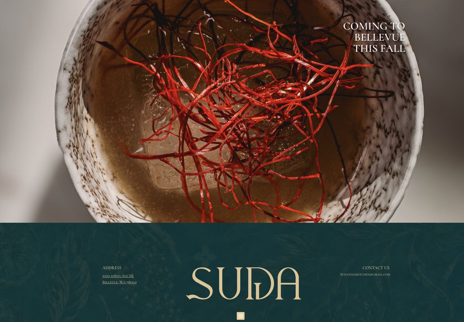
We built the identity around the line "Thai-rooted. Reimagined." A custom wordmark in gold sits on deep green, with a faint botanical line-art pattern behind it that nods to Thai herbs and fruit. Type is a refined serif in small caps. The website carries the same look from the first screen: one full-bleed photograph of dried chilli in a handmade bowl, a clear "Coming to Bellevue this fall" message, and a footer with the address, contact email and Instagram, plus links to the group's sister restaurants.
Our Approach
Understand the concept
We started from how SUDA describes itself: traditional recipes and flavours, new ideas, nothing changed just to be different. That became the test every design choice had to pass.
Design the identity
We drew the wordmark, chose a gold and deep-green palette and a botanical pattern, and set the type, so the brand feels warm and refined rather than like a generic Thai restaurant look.
Build the launch website
We turned the identity into a responsive page with one strong photograph, a clear message and the practical details guests look for first.
UI Solution 01
A brand with a point of view
- Custom gold wordmark on deep green
- Botanical line-art pattern used as a quiet background
- Serif small-caps typography across the site
Illustration of the idea, not a screenshot
Illustration of the idea, not a screenshot
UI Solution 02
A launch page that does its job
- Full-bleed photograph and a clear opening message
- Address and contact email, with a link to Instagram
- Links to the group's sister Thai restaurants
- Responsive from phone to desktop
Illustration of the idea, not a screenshot
Illustration of the idea, not a screenshot
Project Flow
How the project moved from first brief to delivery.
What We Developed
Languages & Technology
What we can share openly. Parts that are confidential to the client are not listed.
Languages
Key Features
A brand with a point of view
- Custom gold wordmark on deep green
- Botanical line-art pattern used as a quiet background
- Serif small-caps typography across the site
A launch page that does its job
- Full-bleed photograph and a clear opening message
- Address and contact email, with a link to Instagram
- Links to the group's sister Thai restaurants
- Responsive from phone to desktop